I watched David Reich's Big Think interview on ancient DNA1 and it rewired how I think about the past. Reich is a geneticist at Harvard who showed that entire populations left no written record at all. The Yamnaya replaced roughly 75% of Central European genetic ancestry around 4,500 years ago2. We only know because of DNA. “Ghost populations” existed, thrived, and vanished, detectable only as statistical traces in modern genomes3.
That raised a question I couldn't shake. If genetic signal decays exponentially with time (recombination chops ancestral blocks smaller each generation, drift erases rare lineages), does everything else decay the same way? Academic papers, biographical records, surviving sources, how often we mention a century in books. I wanted to measure it. I built this project using Claude Code, Anthropic's AI coding assistant, to collect the data, run the statistical analysis, and render the charts you see below.
Five Thousand Years of Data, at a Glance
I assembled five distinct measures to capture the breadth of historical knowledge. Academic works (via OpenAlex, an open scholarly index described by Priem et al.7) counts research papers tagged to each period. Named individuals tallies Wikipedia biographical articles for people born in each century. Source proxy estimates surviving primary sources: cuneiform tablets and inscriptions for antiquity, manuscript production for the medieval period (following Buringh & Van Zanden 20094), and print title counts for the early modern and modern eras. Ngram discourse measures how frequently each century is mentioned in the Google Books English corpus6. And films, a supplementary cultural metric, counts movies set in each period.
The chart below plots all five metrics for every time period, on a logarithmic scale (use the buttons to switch to linear). Toggle individual metrics on or off by clicking the legend. The pattern is unmistakable: every single metric climbs steeply as you approach the present.
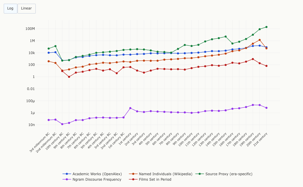
The 20th century dominates every measure: 1.37 million Wikipedia biographies, 156,000 academic works, and an estimated 85 million publications. The 3rd millennium BC, by contrast, has just 385 known individuals and 50,000 surviving inscriptions. Recent history doesn't just have more. It has orders of magnitude more.
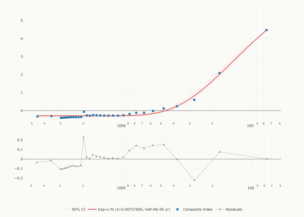
Knowledge Decays Like a Radioactive Isotope
Samuel Arbesman, in The Half-Life of Facts5, proposed that knowledge has a measurable decay rate. I tested this directly. After combining four metrics into a single composite index (using z-scores to put them on a common scale), I tested seven candidate models: exponential decay with and without a baseline, a two-phase (biexponential) model, power laws with and without a baseline, logarithmic, and linear. The exponential family won decisively. The two-phase model fits best by AICc, and the single exponential with a baseline is a close second. I use the single exponential as the primary specification, an honest tradeoff: with 32 data points I would rather report the model with two fewer parameters, even though it is technically the second-best fit. Both are reported in the methodology section, and the two-phase fit turns out to be the more interesting result. I will come back to it.
Just as uranium-238 decays at a predictable rate, historical knowledge follows a smooth exponential curve. The best-fit model gives a half-life of about 95 years. That means for every 95 years further back you look, the above-baseline portion of the composite knowledge index roughly halves. The shaded band below shows the uncertainty range: the true half-life likely falls between 87 and 107 years.
Here I owe you a correction. The first version of this essay reported a half-life of 84 years. Two things were wrong with how I got that number. First, the model: I fit an exponential forced to decay all the way to zero, but the composite index is built from z-scores and its ancient tail sits on a floor near minus 0.33. A curve required to reach zero cannot follow data that never gets there, and the residuals said so loudly (the published fit's Durbin-Watson statistic was 0.17, which is textbook misspecification). Second, the scaling: the published pipeline standardized each metric using only the century-length periods, accidentally including the incomplete 21st century. Fixing the model alone moves the estimate to about 109 years. Fixing the scaling alone moves it to 78.5. Fixing both, which is the only defensible choice, gives 95 years, and the corrected notebook reproduces the old 84 exactly when I rerun it under the old specification. R-squared rises from 0.83 to 0.99 and the autocorrelation largely disappears (Durbin-Watson 1.17). One more honesty note: the old point estimate of 84 falls outside the new interval of 87 to 107. That is what fixing a misspecified model looks like; the old uncertainty range (23 to 101) came from that same misspecified model and an unstructured bootstrap dominated by a few high-leverage points, so neither the old point nor the old interval was reliable. I have kept the original number visible here because a result that changes when you fix the model is exactly the kind of thing this essay is about.
The residual plot underneath reveals which centuries defy the trend. Points far from the zero line are centuries with unusual stories to tell. Two stand out: the 1st century CE sits well above the curve (+2.45 standard residuals, driven by its biblical and Roman cultural footprint), while the 18th century sits below it (−2.38), receiving less attention than its position in time would predict.
Why Roughly a Century?
A half-life of about 95 years invites an obvious question: is it real, or just an artifact of one particular dataset and method? The strongest test of any empirical claim is independent replication: a different team, using different data, arriving at the same answer.
The most striking corroboration is structural. The model that fits my data best is not the single exponential at all but a biexponential: two decay processes running at once, a fast component with a half-life of 84 years and a slow one of roughly 800 years. That is the same two-regime form Candia et al. found in 2019 for songs, films, and biographies9: a quickly fading communicative layer and a slowly fading cultural one. I did not go looking for their model. It emerged from the model comparison on a dataset spanning five millennia instead of decades.
There is also a consistency check on the fast component. Michel et al., in their 2011 Science paper that launched Google Ngrams as a research tool6, tracked the fame trajectories of individual people by measuring how quickly a person's name rises and falls in book mentions. For people born around 1865, the post-peak half-life of fame was roughly 73 years. My fast component lands at 84, within a few decades of their figure despite an entirely different method: a composite of four metrics, z-scored, spanning five millennia instead of two centuries, measuring eras instead of individuals. A skeptic would note that Google Ngrams appears in both studies, and that is fair. But in my composite, Ngrams is one of four equally weighted metrics. The other three (academic papers, Wikipedia biographies, and surviving sources) have nothing to do with book mentions.
There may be a reason the fast layer fades over decades rather than centuries. The Egyptologist Jan Assmann drew a distinction between what he called “communicative memory” (what gets transmitted orally across three or four generations, roughly 80 to 100 years) and “cultural memory,” the kind that survives only when institutions write it down and teach it8. A half-life of roughly a century sits right at that boundary. It is approximately the point where the last person who heard the story firsthand dies, and whatever was not committed to text, stone, or institutional habit begins to vanish.
So three independent anchors bracket the fast layer: Michel's 73 years, my fast component of 84, and Assmann's 80-to-100-year communicative-memory boundary. The headline figure of 95 is the single-exponential compromise between the fast layer and the slow one, which is why I gloss it as “roughly a century” rather than pretending to more precision than the data supports.
Historians Amplify the Decay, Not Compensate for It
The obvious objection is that of course we know more about recent history. More sources survived. The more interesting question is whether historians compensate for lost sources by studying ancient periods more intensely, or whether they make the imbalance worse.
The chart below answers this by comparing two curves: the green line tracks source availability (surviving tablets, manuscripts, and books), while the blue line tracks academic attention (OpenAlex publication counts). Where academic attention exceeds source availability, the green shading marks an era as overstudied. Where attention falls below sources, the red shading marks it as understudied.
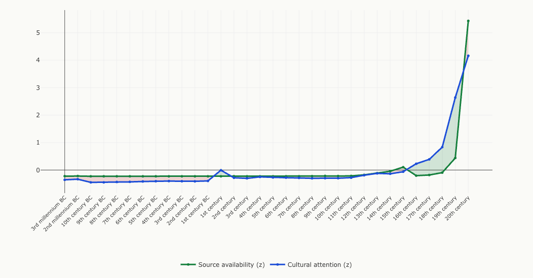
The pattern is stark. Almost every period before the 16th century is understudied (the classical 1st century, with its Roman and biblical pull, is the lone exception at +0.22). Historians give these periods less attention than their surviving source base would predict; the 12th century sits almost exactly at the crossover. From the 16th century onward, attention runs ahead of sources, and the gap widens steadily: +0.43 for the 16th century, +0.57 for the 17th, +0.93 for the 18th, peaking at +2.20 for the 19th, likely reflecting Anglophone historiographic priorities. Then comes the surprise: the 20th century is understudied (−1.27). Source production exploded faster than scholarly attention could keep up. (The 21st century is excluded from this comparison: it is not yet history, and its partial data would distort the standardization.)
One important caveat: the source proxy changes measurement method across eras (inscriptions in antiquity, manuscripts in the medieval period, print titles after Gutenberg). Cross-era comparisons are therefore approximate, not exact. But the overall direction of the bias is clear regardless.
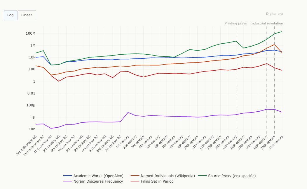
What Drove the Acceleration
When all four metrics (plus the supplementary films count) are overlaid on a single timeline, the overall trajectory is a smooth upward climb, consistent with the exponential model from the previous chapter. But three historical transitions contributed disproportionately to that acceleration. Around the 1450s, the printing press began a slow transformation of source availability; the named-individuals and academic-works lines begin to steepen in the centuries after Gutenberg, though the effect takes generations to appear. Around 1800, mass literacy, state record-keeping, and industrialization pushed most metrics into steeper growth: the 19th century shows the largest single-century jumps across multiple measures. And the 20th century's digital infrastructure produced a final surge in some metrics, though not all: academic works barely grew from the 19th century, while named individuals and source volumes exploded.
Use the Log/Linear buttons below to switch between scales. On a linear scale, the 20th century towers so far above everything else that ancient history becomes a flat line at zero. The log scale reveals the continuous nature of the acceleration: there is no single moment where everything changes at once, but rather a compounding process that these three transitions each amplified.
A Bird's-Eye View Reveals Dark Zones and Bright Hotspots
The heatmap below offers a compact view of all five metrics across all 33 time periods, with warmer colors indicating higher relative knowledge density (ranked within each metric, so colors reflect relative standing rather than absolute values). The “dark” zones (the 10th–9th centuries BC, the early medieval period) are the deep troughs of human knowledge, eras where very few named individuals survive, minimal inscriptions exist, and academic attention is nearly absent.
In contrast, bright hotspots mark periods with disproportionate cultural footprints: Classical Greece (5th century BC), Imperial Rome (1st–2nd century CE), and of course the entire modern era. The rightmost columns glow with intensity.
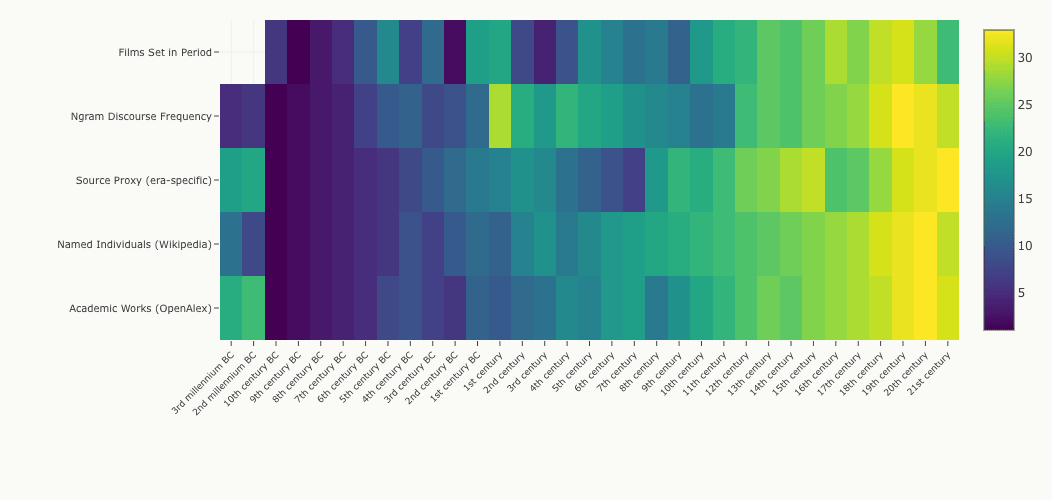
One visible anomaly: the 1st century CE has an inflated ngram score. This is a data quality issue. The phrase “first century” appears frequently in non-historical contexts (“the first century of the Industrial Revolution,” “the first century of American democracy”), artificially boosting the signal. I'm flagging this rather than smoothing it away.
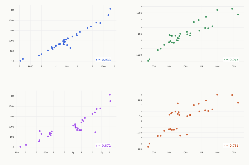
All Four Metrics Independently Agree
If academic papers, Wikipedia articles, surviving sources, and book mentions all point in the same direction, the overall pattern is robust. The scatter plots below show this directly. Each dot is one time period. When two metrics track each other, the dots line up along a diagonal. They do, consistently: Spearman rank correlations range from 0.78 to 0.93, all statistically significant after Benjamini-Hochberg correction.
This validates combining the metrics into a single composite index. They aren't telling four different stories. They are four witnesses to the same underlying phenomenon: the exponential erosion of historical knowledge over time.
Other researchers have approached the question with narrower scope. Candia et al. tracked how quickly specific cultural products (songs, movies, biographies) fade from online attention, finding a two-phase curve: a fast-decaying communicative component with a half-life of 20 to 30 years for biographies, and a slow-decaying cultural component that persists for centuries9. When Kestemont et al. applied mark-recapture methods from ecology to medieval manuscripts, they estimated that more than 90% of chivalric and heroic narratives from the period were lost entirely10. My composite index blends both layers of memory into a single curve, and the two regimes are no longer a speculation here: the best-fitting model resolves them directly, a fast component near 84 years and a slow one near 800.
Why This Matters
A one-century half-life is not just a statistical curiosity. It has practical consequences for how we build knowledge systems today.
Large language models are trained on text corpora that inherit this exponential gradient. The composite index shows that for any period more than a century in the past, the above-baseline portion of available documentation drops by half. For periods more than five centuries ago, it falls to a few percent of the modern level (about 2.6%, by the fitted curve). AI systems trained on these corpora do not merely reflect the biases of their curators. They absorb a structural decay that has been compounding for millennia. The model cannot flag what it does not know.
The finding also makes a concrete prediction. If the historical pattern holds, roughly half of what we currently document about the 2020s (the pandemic, the AI revolution, the wars) will have faded from active scholarship, Wikipedia coverage, and public discourse by the early 2120s. Not because the information is destroyed, but because collective attention shifts forward. This is what the decay curve shows for every previous era without exception.
That all four metrics decay at the same rate (Cronbach's alpha = 0.95) means this is not a problem confined to one domain. Archives, curricula, academic funding, and public discourse all participate in the same forgetting. Counter-decay strategies (digitization, open access, funding for ancient and medieval studies) need to explicitly account for an exponential gradient, not assume that the past preserves itself.
Objections and Responses
Every objection below has occurred to me, usually at 2am. Here is where each one lands.
Didn't you measure attention, not knowledge?
Largely conceded. What the composite tracks is present-day attention and documentation density: papers written, biographies maintained, mentions in books. I cannot distinguish knowledge decay from evidence destruction. Fewer named individuals from the 7th century BC may mean fewer records survived, fewer were translated, or fewer were deemed notable by later generations. Survivorship bias runs through every metric here; when Kestemont et al. applied unseen species models to medieval literature, they estimated more than 90% of chivalric and heroic narratives were lost entirely10. So read the half-life as a property of the record we can see. I would only add that the record we can see is exactly what an AI system trains on, which is why I think the measurement matters anyway.
Doesn't the half-life depend on the scale you fit on?
Yes, and the dependence is informative rather than embarrassing. Fitting on the raw scale gives you the fast end: 95 years for the single-exponential compromise, 84 for the pure fast component. Fitting the log-scale composite instead gives a half-life of roughly 800 years, which coincides with the slow component of the biexponential fit. The two scales are picking out the two regimes Candia et al. describe: communicative memory and cultural memory. Both numbers are reported, and the two-regime reading reconciles them.
This is an Anglophone dataset.
Conceded flatly. OpenAlex, English Wikipedia, the English Google Books corpus, and a source proxy weighted toward European archives. Chinese dynastic records, Islamic manuscript traditions, and Sanskrit corpora would trace their own curves, and I would genuinely like to see someone run this on them. The data and code are CC-BY for exactly that reason.
Your source proxy is stitched together and partly hand-estimated.
True. It splices inscription counts, manuscript production estimates, and print title counts across eras, and 16 of its 33 values are tier-3 manual estimates, each flagged per-value in the codebook. The strongest version of this objection is to drop the metric entirely, so I did: without the source proxy the half-life becomes 123 years. The conclusion that survives every variant is a fast layer of decades-to-a-century riding on an exponential family; if anything, removing my hand-estimated metric makes the decay slower, not faster.
Don't a few modern centuries drive the fit?
Less than I feared. Dropping each of the 32 periods one at a time and refitting gives half-lives from 92.5 to 103.6 years; the worst cases are dropping the 19th or 18th century, and the estimate never leaves the bootstrap interval. There is one analytic choice worth disclosing: standardizing the metrics on all periods rather than the 32 fitted ones moves the estimate to about 109 years. I report 95 because standardizing on exactly the rows you fit is the defensible default, but the difference tells you the second digit is soft.
Thirty-three data points, four correlated metrics.
Conceded. With inter-metric correlations of 0.78 to 0.93, I have something closer to one and a half independent witnesses than four, and a Cronbach's alpha of 0.95 is evidence that the metrics measure one coherent construct, not evidence of independent replication. Two of the six metrics originally collected were dropped for exactly this reason: the Wikipedia people count duplicated named individuals, and the events count was empty. I have tried to state the estimate at the precision the data supports, roughly a century rather than 95.25 years, and everything is published so that someone with better data can break it.
What Gets Lost
The past is not equally preserved. It fades in a measurable, predictable way. An exponential curve as clean as any in physics. And the institutions we build to study history don't fight this decay. They amplify it, pouring attention onto the centuries that already have the most sources while the deep past grows quieter.
Reich showed that DNA preserves what texts cannot. But even DNA decays. Recombination chops ancestral blocks smaller each generation. Drift erases rare lineages. Everything in the historical record follows the same pattern. The signal fades. That's the finding.
This analysis reflects Anglophone and Western historiographic traditions. Chinese dynastic records, Islamic manuscript traditions, and Indian literary heritage would trace different curves. The half-life of history isn't a universal constant. It's a measure of what one civilization chose to preserve and what it chose to study.
Methodology & Technical Details
Correction to the Original Estimate (June 2026)
The April 2026 version of this essay reported a half-life of 84 years (see the archived original). Two defects produced that figure. First, the model had no intercept: the exponential was forced to decay to zero even though the z-score composite has a floor near −0.33, and the misfit showed in a Durbin-Watson statistic of 0.17. Second, the standardization: each metric was z-scored using only the century-length periods, accidentally including the incomplete 21st century. The corrected pipeline fixes both. The table below shows the half-life under every combination of the two choices; the corrected notebook reproduces the published 84.0 exactly under the original specification.
| Specification | All 33 periods | Century rows (v1 published) | 32 fit periods (corrected) |
|---|---|---|---|
| No intercept (v1 model) | 85.2 | 84.0 (published) | 78.5 |
| With intercept (corrected) | 109.1 | 109.3 | 95.3 (corrected) |
Fixing the model alone gives roughly 109 years; fixing the scaling alone gives 78.5; fixing both gives 95. One further note on the old uncertainty range: the published interval (23 to 101 years) came from the misspecified model and an unstructured bootstrap dominated by a few high-leverage points (its median, 71, sat far from the point estimate of 84). The old point lies outside the corrected interval of 87 to 107, which is the expected outcome of fixing a misspecified model, not evidence against the new fit.
Model Selection
Seven candidate models were fitted to the composite index for 32 time periods (the partial 21st century excluded), ranked here by AICc:
The biexponential with baseline fits best by AICc and resolves a fast component (half-life 84 years) and a slow component (roughly 800 years). The primary specification is the single exponential with baseline, y = a · e−λt + c, with a = 8.28, λ = 0.00728, c = −0.288, giving a half-life of 95.3 years (ln 2 / λ). It sits about 10 AICc points behind the biexponential but uses two fewer parameters, a parsimony tradeoff I prefer at n = 32. The half-life is defined on the decaying part of the signal: how far back you go for the above-baseline portion of the index to halve. The composite itself never halves below the floor c.
Bootstrap Confidence Intervals
Because the residuals are serially correlated in time, the primary uncertainty estimate uses a moving-block residual bootstrap (block length b = 8, 10,000 resamples): residuals from the fitted exponential-with-baseline model are resampled in contiguous blocks, added back to the fitted curve, and the model is refit on each synthetic dataset. The 95% interval for the half-life is 87 to 107 years, with the bootstrap median (95.5) sitting on the point estimate, which indicates no leverage bias. Robustness runs with b = 5 and with iid residual resampling give materially the same interval. (The original version used an iid pairs bootstrap whose median, 71, sat far from its point estimate of 84, one of the symptoms of the misspecification described above.)
Composite Index Construction
Four metrics were used in the composite index: OpenAlex academic work counts, Wikipedia named individuals, era-specific source proxy, and Google Books ngram discourse frequency. Two metrics were excluded: wikipedia_people_count (identical to named individuals for all 33 periods, both drawing from the same PetScan query) and wikipedia_events_count (null for all periods). Films set in each period are collected and displayed but treated as supplementary and not included in the composite. Each metric was z-scored using the mean and standard deviation (ddof = 1) of the 32 fitted periods, with the incomplete 21st century excluded from both the standardization and the fit. The arithmetic mean of available z-scores per period formed the composite index.
Bias Residual
The bias chart compares z-scored source availability against z-scored academic attention (OpenAlex works). The residual (attention minus source) indicates whether an era receives more or less scholarly focus than its surviving source base would predict. The chart and the prose cover the 32 fitted periods only: under the canonical standardization the partial 21st century produces a large negative artifact (z-source +13), so it is excluded as not-yet-history. The source proxy changes measurement regime across eras: cuneiform tablets and inscriptions for antiquity, manuscript production estimates (Buringh & Van Zanden 2009) for the medieval period, print title counts (USTC, Britannica) for the early modern era, and publication volume estimates for the modern period.
Correlation Analysis
Pairwise Spearman rank correlations were computed between the four metrics used in the composite. P-values were adjusted using the Benjamini-Hochberg FDR correction at α = 0.05. All pairs were statistically significant, with Spearman r values ranging from 0.78 to 0.93.
Data Sources
- OpenAlex API (academic works, History concept C95457728)
- PetScan / Wikipedia API (biography article counts)
- Google Books Ngram Viewer (discourse frequency, en-2019 corpus)
- Buringh & Van Zanden 2009 via Our World in Data (manuscript production)
- USTC / ISTC (print edition counts)
- Britannica / UNESCO (modern publication volumes)
- EDH / PHI / CDLI (inscription/tablet databases)
- Wikipedia Films categories (supplementary)
Sensitivity Analysis
To assess the stability of the half-life estimate, several sensitivity checks were performed:
Leave-one-metric-out: Dropping each of the four metrics in turn and refitting yields half-lives from 70.9 to 123.0 years. The estimate is most sensitive to dropping the source proxy (123.0) or named individuals (118.5) and least sensitive to dropping ngram discourse (70.9); R-squared stays between 0.98 and 0.99 in every variant.
Leave-one-period-out: Dropping each of the 32 fitted periods in turn and refitting gives half-lives from 92.5 years (drop the 19th century) to 103.6 years (drop the 18th); every other drop lands between 93.6 and 96.0. No single period moves the estimate outside the bootstrap interval.
Exclude millennia: Removing the two aggregated millennia (which span 10x the time of century-level data) and refitting yields a half-life of 95.3 years (N=30), virtually identical to the full estimate.
Exclude 1st century CE: Removing the 1st century (whose ngram value is inflated by non-historical usage) yields 96.0 years (N=31), essentially unchanged.
Median composite: Using the median instead of the mean to aggregate z-scores yields a half-life of 95.7 years, within the confidence interval.
Log-scale composite: Fitting the log-scale composite gives a half-life of roughly 818 years (R² = 0.86), coinciding with the slow component of the biexponential fit rather than the fast layer.
Residual Diagnostics
Diagnostic tests on the residuals of the primary (exponential-with-baseline) model:
The Durbin-Watson statistic of 1.17 (where 2.0 indicates no autocorrelation) shows mild residual autocorrelation, a large improvement over the misspecified original. As a legacy exhibit: the published fit's DW was 0.17, and refitting the no-intercept model on the corrected composite gives 0.16; both are textbook misspecification. Normality is no longer rejected (Shapiro-Wilk p = 0.37) and there is no evidence of heteroscedasticity (Goldfeld-Quandt ratio 1.24, p = 0.34). Two periods exceed two standard residuals: the 1st century CE at +2.45 (above the curve) and the 18th century at −2.38 (below it).
Scale Reliability
To assess whether the four metrics measure a coherent underlying construct:
Cronbach's alpha of 0.954 far exceeds the conventional threshold of 0.7 for acceptable internal consistency. The first principal component explains 87.8% of variance across the four metrics, confirming that a single latent dimension (plausibly “historical knowledge density”) accounts for most of the shared variation. Both statistics are computed on the 32 fitted periods; the originally published values (alpha 0.879, PC1 74.8%) were computed under the old standardization basis.
Data downloads: data.csv, data.json, codebook. Released under CC-BY-4.0. The full dataset, analysis notebook, and results are also archived with a citable DOI on OSF: 10.17605/OSF.IO/TY5G9. A preprint is also posted on SSRN.
References
- Reich, D. (2026). Your ancestors aren't who you think they are [Interview]. Big Think. https://www.youtube.com/watch?v=a0uKLW07Jlg
- Haak, W., et al. (2015). Massive migration from the steppe was a source for Indo-European languages in Europe. Nature, 522, 207–211. doi:10.1038/nature14317
- Lazaridis, I., et al. (2014). Ancient human genomes suggest three ancestral populations for present-day Europeans. Nature, 513, 409–413. doi:10.1038/nature12736
- Buringh, E. & Van Zanden, J.L. (2009). Charting the “Rise of the West”: Manuscripts and Printed Books in Europe, A Long-Term Perspective. Journal of Economic History, 69(2), 409–445. doi:10.1017/S0022050709000837
- Arbesman, S. (2012). The Half-Life of Facts: Why Everything We Know Has an Expiration Date. Current/Penguin. penguinrandomhouse.com
- Michel, J.B., et al. (2011). Quantitative Analysis of Culture Using Millions of Digitized Books. Science, 331, 176–182. doi:10.1126/science.1199644
- Priem, J., Piwowar, H. & Orr, R. (2022). OpenAlex: A fully-open index of scholarly works, authors, venues, institutions, and concepts. arXiv:2205.01833. doi:10.48550/arXiv.2205.01833
- Assmann, J. (1995). Collective Memory and Cultural Identity. New German Critique, 65, 125–133. doi:10.2307/488538
- Candia, C., et al. (2019). The universal decay of collective memory and attention. Nature Human Behaviour, 3, 82–91. doi:10.1038/s41562-018-0474-5
- Kestemont, M., et al. (2022). Forgotten books: The application of unseen species models to the survival of culture. Science, 375, 765–769. doi:10.1126/science.abl7655
Data & Downloads
The complete dataset behind this essay is available below. Six metrics were collected for 33 time periods spanning the 3rd millennium BC to the 21st century; four are used in the composite index (two were excluded as redundant or empty). Download the data in CSV (for spreadsheets) or JSON (for programmatic analysis, includes per-value provenance: tier, source link, and notes).
What each metric measures
Academic Works
Count of history-tagged research publications indexed in OpenAlex, an open scholarly database. Captures how much academic attention each era receives.
Named Individuals
Count of Wikipedia biographical articles for people born in each century. A proxy for how many specific people from each era are remembered today.
Source Proxy
Estimated surviving primary sources. The measurement method changes across eras: cuneiform tablets and inscriptions for antiquity, manuscript production estimates for the medieval period, and print title counts for the modern era. Cross-era comparisons are therefore approximate.
Ngram Discourse
How frequently each century is mentioned in the Google Books English corpus (2000-2019 subset). Measures how much a given era is discussed in published books.
Films (supplementary)
Count of movies set in each time period, from Wikipedia film categories. Included as a supplementary cultural signal; not available for all ancient periods.
Data Provenance
Data Sources
Every data point in the table above links to its source via the tier badge. The databases and APIs queried for this dataset:
| Source | Used for |
|---|---|
| OpenAlex | Academic work counts (History concept filter) |
| PetScan | Wikipedia category counting (named individuals) |
| Google Books Ngram Viewer | Discourse frequency (en-2019 corpus, 2000–2019) |
| Wikipedia API | Film category counts per century |
| CDLI | Cuneiform tablet estimates (3rd millennium BC) |
| BDTNS | Neo-Sumerian texts (2nd millennium BC) |
| Epigraphic Database Heidelberg | Latin & Greek inscriptions (Roman era) |
| PHI Greek Inscriptions | Greek inscription counts (8th–3rd c. BC) |
| Attic Inscriptions Online | Athenian inscriptions (5th c. BC) |
| Our World in Data | Buringh & Van Zanden manuscript production (6th–15th c.) |
| USTC | Early modern print editions (15th–17th c.) |
| Encyclopaedia Britannica | 18th–19th c. publication volume estimates |
| NPR / Google Books | 130M unique book titles estimate (20th c.) |
| Statista | Global digital data creation (21st c.) |
wikipedia_people_countis identical tonamed_individuals(same PetScan query); excluded from analysis to avoid double-countingwikipedia_events_countis null for all periods; excluded- 1st century CE ngram value inflated by non-historical usage of “first century”
- Source proxy changes measurement method across eras (inscriptions, manuscripts, print titles)
- Scope is Anglophone/Western; other historiographic traditions would show different curves
Sensitivity Summary
| Variant | Half-life (years) | R² |
|---|---|---|
| Headline (all four metrics) | 95.3 | 0.99 |
| Drop openalex_work_count | 74.1 | 0.99 |
| Drop named_individuals | 118.5 | 0.98 |
| Drop source_proxy | 123.0 | 0.98 |
| Drop ngram_discourse | 70.9 | 0.99 |
| Exclude millennia | 95.3 | 0.99 |
| Exclude 1st century | 96.0 | 0.99 |
| Median composite | 95.7 | 0.99 |
| Log-scale composite (slow layer) | 817.7 | 0.86 |
How to Cite
| Period | Academic Works | Named Individuals | Source Proxy | Ngram Discourse | Films |
|---|---|---|---|---|---|
| 3rd millennium BC | 10,156T1 | 385T1 | 50,000T3 | 6.54e-8T1 | · |
| 2nd millennium BC | 12,471T1 | 201T1 | 130,000T2 | 7.51e-8T1 | · |
| 10th century BC | 526T1 | 11T1 | 500T3 | 1.34e-8T1 | 9T1 |
| 9th century BC | 619T1 | 17T1 | 600T3 | 2.13e-8T1 | 1T1 |
| 8th century BC | 1,713T1 | 37T1 | 2,000T3 | 6.20e-8T1 | 5T1 |
| 7th century BC | 2,003T1 | 49T1 | 3,000T3 | 6.37e-8T1 | 7T1 |
| 6th century BC | 3,016T1 | 114T1 | 5,000T3 | 1.28e-7T1 | 13T1 |
| 5th century BC | 4,049T1 | 150T1 | 10,000T3 | 1.60e-7T1 | 21T1 |
| 4th century BC | 4,523T1 | 221T1 | 12,000T3 | 1.66e-7T1 | 11T1 |
| 3rd century BC | 3,929T1 | 194T1 | 15,000T3 | 1.47e-7T1 | 18T1 |
| 2nd century BC | 3,793T1 | 260T1 | 20,000T3 | 1.48e-7T1 | 4T1 |
| 1st century BC | 5,007T1 | 355T1 | 30,000T3 | 1.74e-7T1 | 38T1 |
| 1st century | 4,930T1 | 294T1 | 35,000T3 | 6.11e-6T1 | 42T1 |
| 2nd century | 6,023T1 | 469T1 | 40,000T3 | 1.78e-6T1 | 11T1 |
| 3rd century | 6,474T1 | 493T1 | 35,000T3 | 1.39e-6T1 | 5T1 |
| 4th century | 8,252T1 | 467T1 | 25,000T3 | 1.94e-6T1 | 11T1 |
| 5th century | 8,058T1 | 473T1 | 15,000T3 | 1.65e-6T1 | 22T1 |
| 6th century | 8,418T1 | 719T1 | 13,551T2 | 1.46e-6T1 | 20T1 |
| 7th century | 8,941T1 | 819T1 | 10,640T2 | 1.25e-6T1 | 18T1 |
| 8th century | 7,880T1 | 944T1 | 43,703T2 | 1.20e-6T1 | 19T1 |
| 9th century | 8,400T1 | 1,251T1 | 201,742T2 | 1.19e-6T1 | 16T1 |
| 10th century | 9,516T1 | 1,311T1 | 135,638T2 | 1.01e-6T1 | 28T1 |
| 11th century | 10,644T1 | 1,797T1 | 212,029T2 | 1.17e-6T1 | 46T1 |
| 12th century | 14,242T1 | 2,655T1 | 768,721T2 | 1.97e-6T1 | 58T1 |
| 13th century | 19,025T1 | 3,439T1 | 1,761,952T2 | 2.32e-6T1 | 87T1 |
| 14th century | 18,545T1 | 4,675T1 | 2,746,951T2 | 2.11e-6T1 | 70T1 |
| 15th century | 22,839T1 | 7,355T1 | 4,999,160T2 | 2.61e-6T1 | 95T1 |
| 16th century | 36,794T1 | 18,250T1 | 350,000T1 | 4.83e-6T1 | 221T1 |
| 17th century | 45,472T1 | 25,234T1 | 700,000T2 | 5.87e-6T1 | 172T1 |
| 18th century | 64,527T1 | 61,299T1 | 2,000,000T2 | 9.24e-6T1 | 331T1 |
| 19th century | 138,099T1 | 326,525T1 | 10,000,000T2 | 2.08e-5T1 | 905T1 |
| 20th century | 156,016T1 | 1,367,010T1 | 85,000,000T2 | 2.00e-5T1 | 181T1 |
| 21st century | 82,723T1 | 55,394T1 | 200,000,000T2 | 6.82e-6T1 | 65T1 |